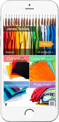
Home
The home screen is divided into product categories called departments. Current offers can be highlighted using an offers button
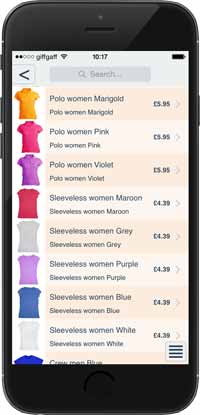
Product list
Shows all the products in department, or those filtered by a search
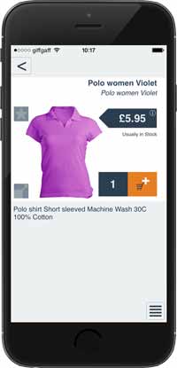
Product detail
Contains all the details about the product, sale price, colour, images and much more. Items can be added to the cart
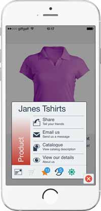
Menu options
Used to move around the app giving access to the various screens
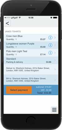
Shopping cart
A view of the items selected for purchase. Allows the purchasing to be completed
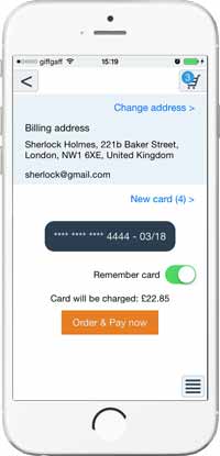
Payment
Confirming the order and selected payment method
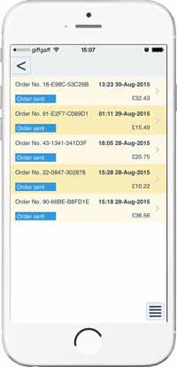
Order history
Listing of previous orders providing access to the order detail
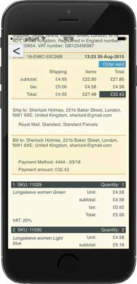
Order detail
Line by line detail of the items ordered and the price paid
